FindMyUCF
FindMyUCF is a mobile app concept designed to help students and visitors navigate the University of Central Florida's campus — finding buildings, classrooms, services, and events without the stress of getting lost. With one of the largest campuses in the country, UCF presented a real wayfinding challenge that existing tools like UCF Mobile and Google Maps simply weren't built to solve.

Role
Project Manager
Team
4 Members
Timeline
Fall 2025
Type
School Project
The Challenge
For new students and first-time visitors, navigating a large university campus can quickly become overwhelming. Finding a building is only part of the problem — users may also need to locate a specific classroom, identify nearby services, find an accessible route, or figure out how to get to their next class.
Existing tools such as UCF Mobile, Google Maps, and campus PDF maps provide pieces of this experience, but they were not designed to work together as a single campus-specific navigation system.
We wanted to explore how a mobile experience could bring these needs together while reducing the stress and uncertainty associated with navigating campus.
Understanding the Problem Space
Before designing the app, our team examined the different people, organizations, technologies, and functions that would influence the experience.
Understanding the stakeholders
We identified key stakeholders and evaluated their level of support, importance to the project's success, goals, motivations, interests, and roles.
This helped us understand that FindMyUCF would need to balance the needs of its primary users with the requirements of the university departments and other stakeholders responsible for maintaining campus information and services.

Stakeholder analysis showing stakeholder roles, support, importance to success, goals, motivations, and interests.
Defining the User Ecosystem
We also separated the people interacting with the system into primary and secondary users and stakeholders. This helped us distinguish between the people directly using the navigation experience and the groups supporting or influencing the product.

User and stakeholder ecosystem showing the relationships between primary users, secondary users, and supporting stakeholders.
Team Formation
Our four-person team established individual responsibilities and collaborated throughout the research, design, and testing process.
Project Manager - Matthew
Prototyping Specialist - Jordan
UX Designer - Angelo
UI Designer - Ryan
Research & Discovery
We began by investigating how students currently navigate UCF and what problems they encounter when trying to find locations and services.
User Research
We conducted 5 user interviews to understand students' experiences navigating campus, particularly when finding unfamiliar buildings and classrooms.
A recurring theme was uncertainty. Users were not simply looking for directions — they wanted confidence that they were going the right way.


User research and survey findings used to identify common navigation challenges.
Understanding User Goals
We translated our research into user goals, tasks, and activities for different types of FindMyUCF users.
This helped us move beyond the general problem of "navigation" and identify specific tasks the product would need to support, such as finding a classroom, locating campus services, planning a route, and navigating between classes.
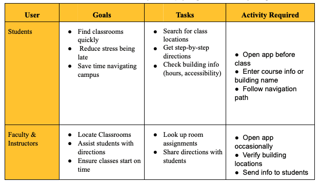
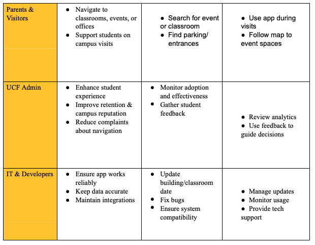
User goals, tasks, and activities identified during the research phase.
Competitive Analysis
To understand where FindMyUCF could provide additional value, we analyzed 12 competing or comparable applications and navigation experiences.
Our research included tools such as UCF Mobile, Google Maps, MazeMap, and Google Maps Live View.
Rather than simply comparing visual designs, we looked at how each product handled navigation, location information, accessibility, scheduling, and campus-specific needs.
The analysis helped identify an opportunity for a more unified experience focused specifically on the UCF campus.
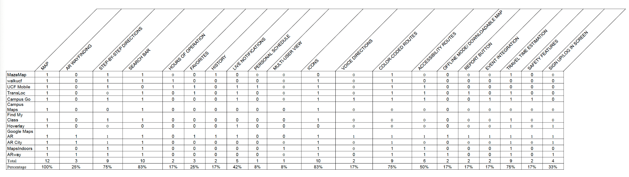
Competitive analysis comparing existing navigation and campus tools.
What We Learned
The research suggested that students were often piecing together information from multiple sources. A successful solution would need to make campus information easier to find while reducing the number of tools users had to switch between.
Information Architecture
With our research findings in mind, we began organizing the information and functionality FindMyUCF would need.
Organizing the Experience
We developed an information architecture that defined the major sections of the application, including navigation, classroom information, saved locations, notifications, and campus services.

Information architecture showing how FindMyUCF's content and functionality were organized.
Navigation Structure
We then translated the information architecture into a navigation structure to determine how users would move through the application.

Navigation structure showing the primary sections and relationships within the application.
Navigation Workflow
The navigation workflow helped us visualize the steps users would take to complete key tasks.

Wireflow showing the relationship between user actions and application screens.
From Ideas to Wireframes
We started the design process with rough sketches and paper prototypes. This allowed us to explore different ideas quickly without becoming attached to a particular visual direction.
Low-Fidelity Exploration
Our initial sketches focused on layout, functionality, and the overall flow of the application rather than visual polish.

Paper prototype used to explore the core interaction and navigation experience.
Wireflow showing the relationship between user actions and application screens.
Exploring Three Design Directions
Rather than immediately committing to one visual style, our team developed three distinct high-fidelity concepts.
Conservative
The Conservative concept focused on familiarity, simplicity, and a more traditional navigation experience.
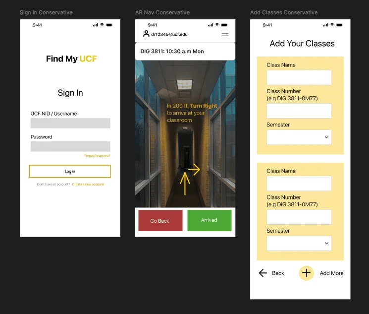
Moderate
The Moderate concept explored a balance between familiar navigation patterns and a more modern visual language.

Wild
The Wild concept pushed the visual and interaction direction further, allowing us to explore a more experimental interpretation of campus navigation.

Comparing these three directions helped our team evaluate which ideas were most effective before moving toward the final design.
Visual Design & Design System
After exploring different directions, we established a visual system for the final experience.
The design system was built around UCF's visual identity, using black, UCF Gold, and white as the primary colors. We also selected SF Pro typography and considered accessibility and contrast throughout the interface.
The goal was to create an interface that felt connected to UCF while remaining clear and functional for navigation.
Key Design Principles
Clarity — Important navigation information should be easy to identify at a glance.
Consistency — Similar actions and information should behave and appear consistently throughout the app.
Accessibility — Routes, controls, and information should remain usable for people with different accessibility needs.
Campus Context — Navigation should be designed specifically around the realities of a university campus rather than treating UCF like a generic map.


Visual design system showing the colors, typography, and interface principles used in the final design
High-Fidelity Prototype
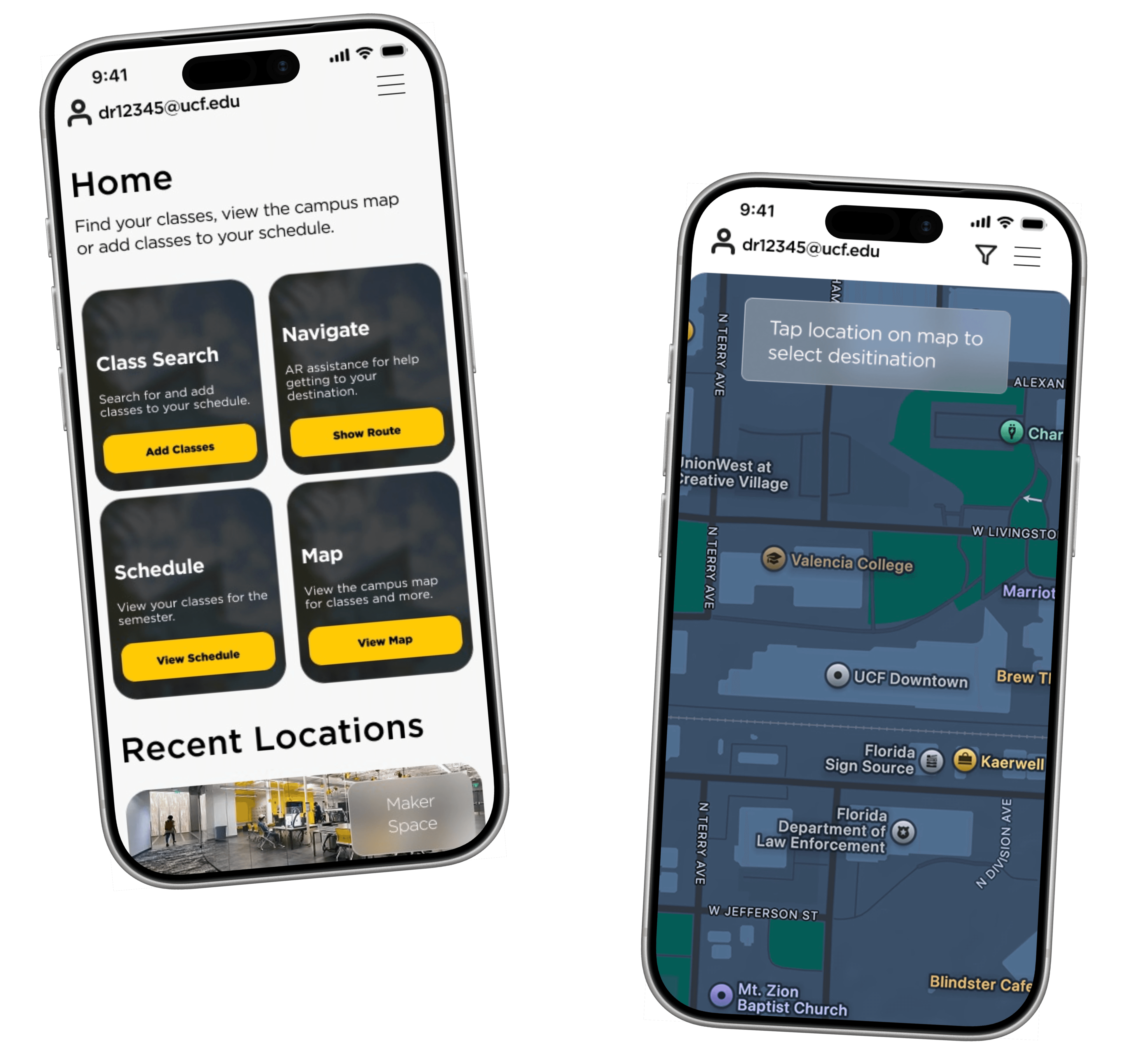
We brought the selected design direction into a fully linked Figma prototype.
The prototype connected the major screens and allowed users to experience FindMyUCF as an interactive product rather than a collection of static screens.

Usability Testing & Iteration
We tested the prototype using think-aloud usability sessions with real users.
The goal was to determine whether users could understand the interface and complete key navigation tasks without significant confusion.
12
Competitors Analyzed
5
User Interviews
0
Critical Usability Errors
Users were able to successfully navigate the prototype, and feedback highlighted the AR navigation and schedule integration as particularly useful.
One participant described the experience as potentially replacing the need to switch between multiple existing tools.
“It would replace my switching between MyUCF, Google Maps, and the PDF campus map. Just having everything in one place would make my day so much less stressful."”

Natalia Thorndyke
Usability Test Participant
Iterations
Testing also identified opportunities to improve the experience. Based on feedback, we refined:
Map icon labeling
Accessibility route visibility
Amenities filtering
Navigation clarity
Information organization
The testing phase demonstrated that the overall concept was understandable while also giving us specific areas to improve before considering the design complete.
The Solution
Conclusion
FindMyUCF demonstrated that campus navigation is about more than simply displaying a map.
Students need to know where they are going, how to get there, what services are nearby, and whether the route works for their individual needs. Our research showed that users were already combining multiple tools to accomplish these tasks.
Through stakeholder analysis, user research, competitive analysis, information architecture, wireframing, prototyping, and usability testing, our team explored how those fragmented experiences could be brought together into one campus-specific product.
The result was a prototype designed to make navigating UCF more understandable, accessible, and less stressful.
Want to explore the full design process?
View the complete project documentation, including research, competitive analysis, personas, information architecture, wireframes, iterations, and usability testing.
View Full Project Documentation →